Mylapore Times — Newspaper Redesign

Role

Editorial &
Visual Designer

Duration

3 weeks

Scope

Cover redesign
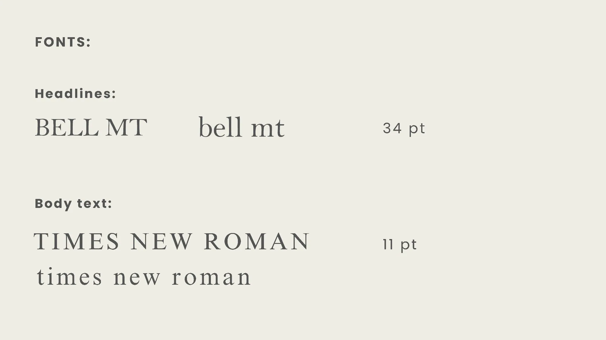
Typographic system
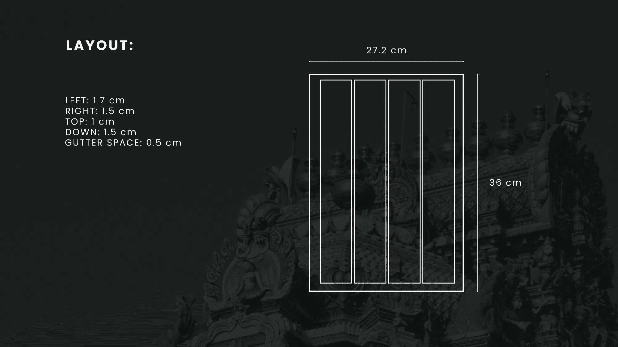
Grid & layout system
Visual hierarchy & content structure
Image placement & spacing system


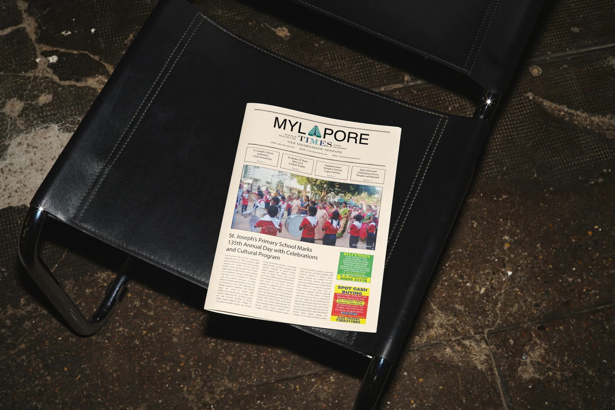
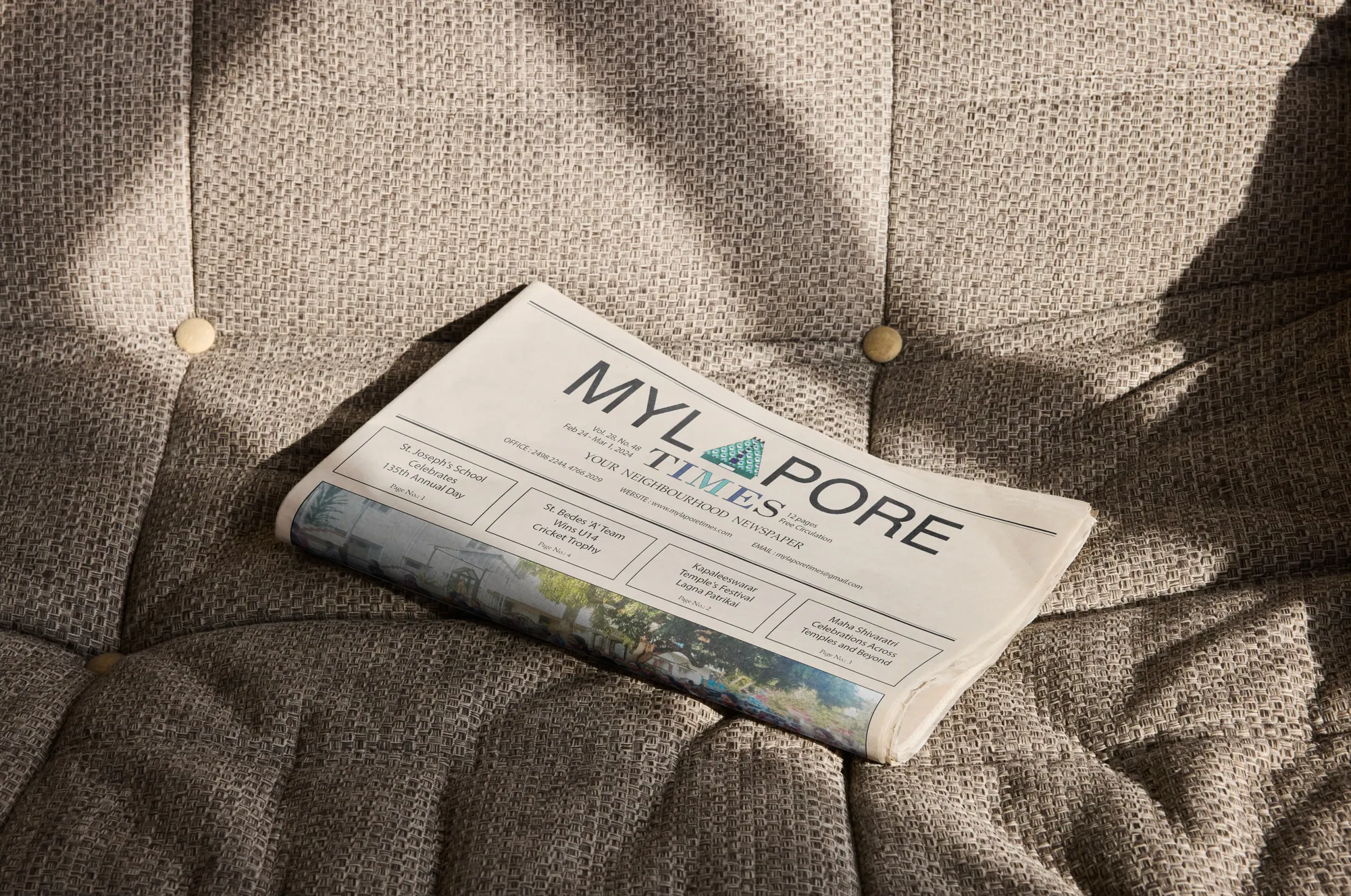
Folded Mylapore Times newspaper on a sofa

A reimagining of the Mylapore Times, a community newspaper serving one of Chennai's most storied neighborhoods, to improve readability, structure, and visual hierarchy while preserving the cultural depth its readers cherish.


Before
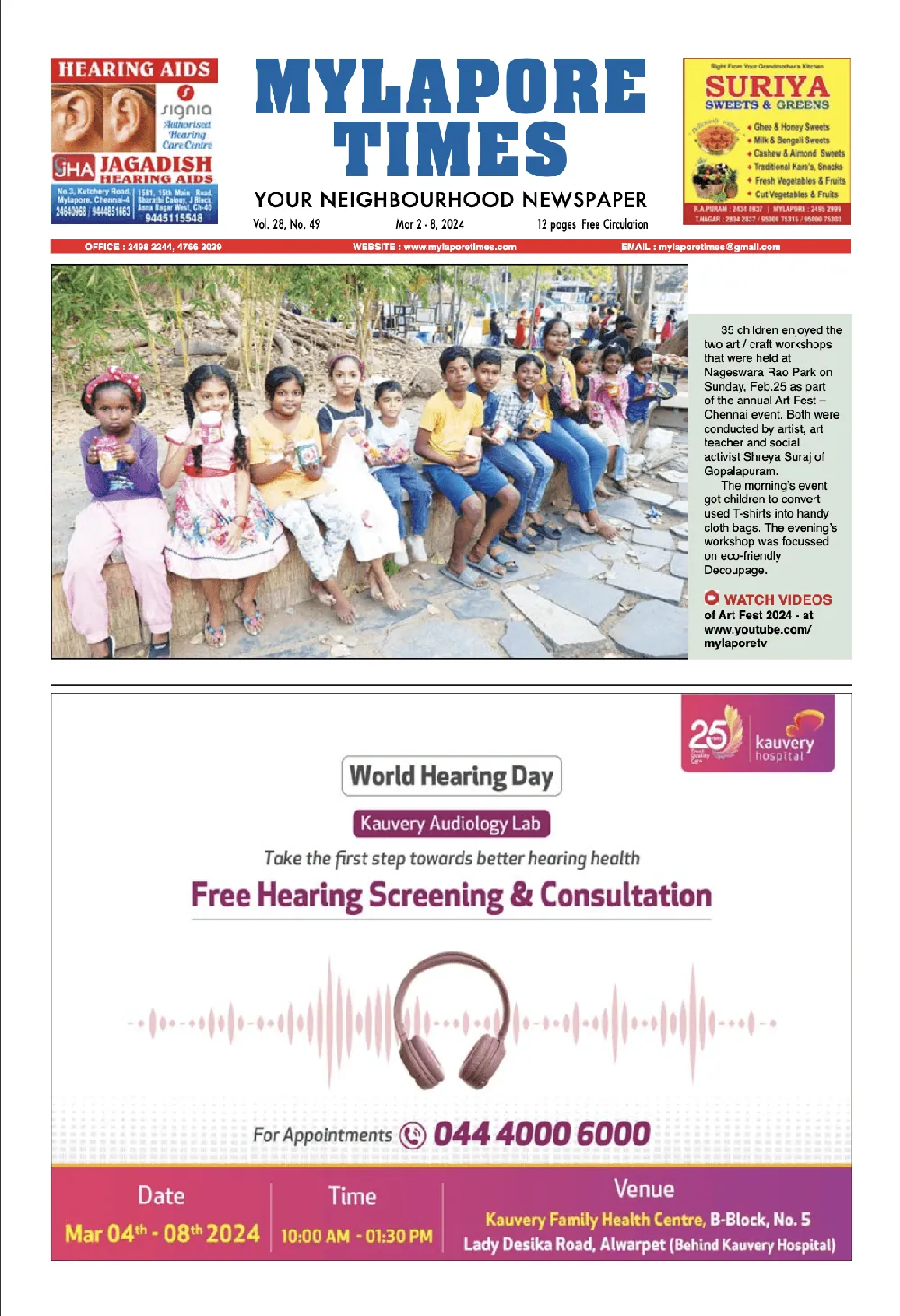
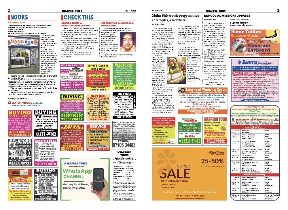
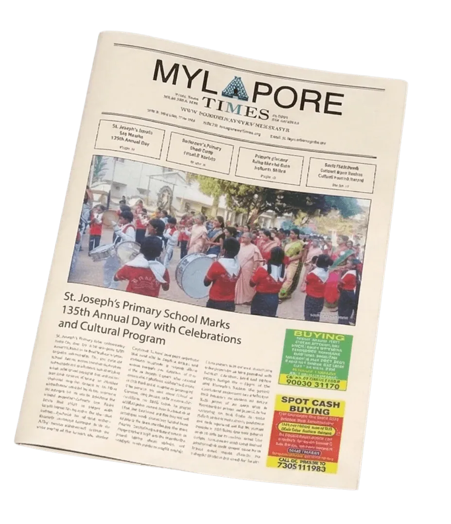
Original Mylapore Times front page Original inside spread

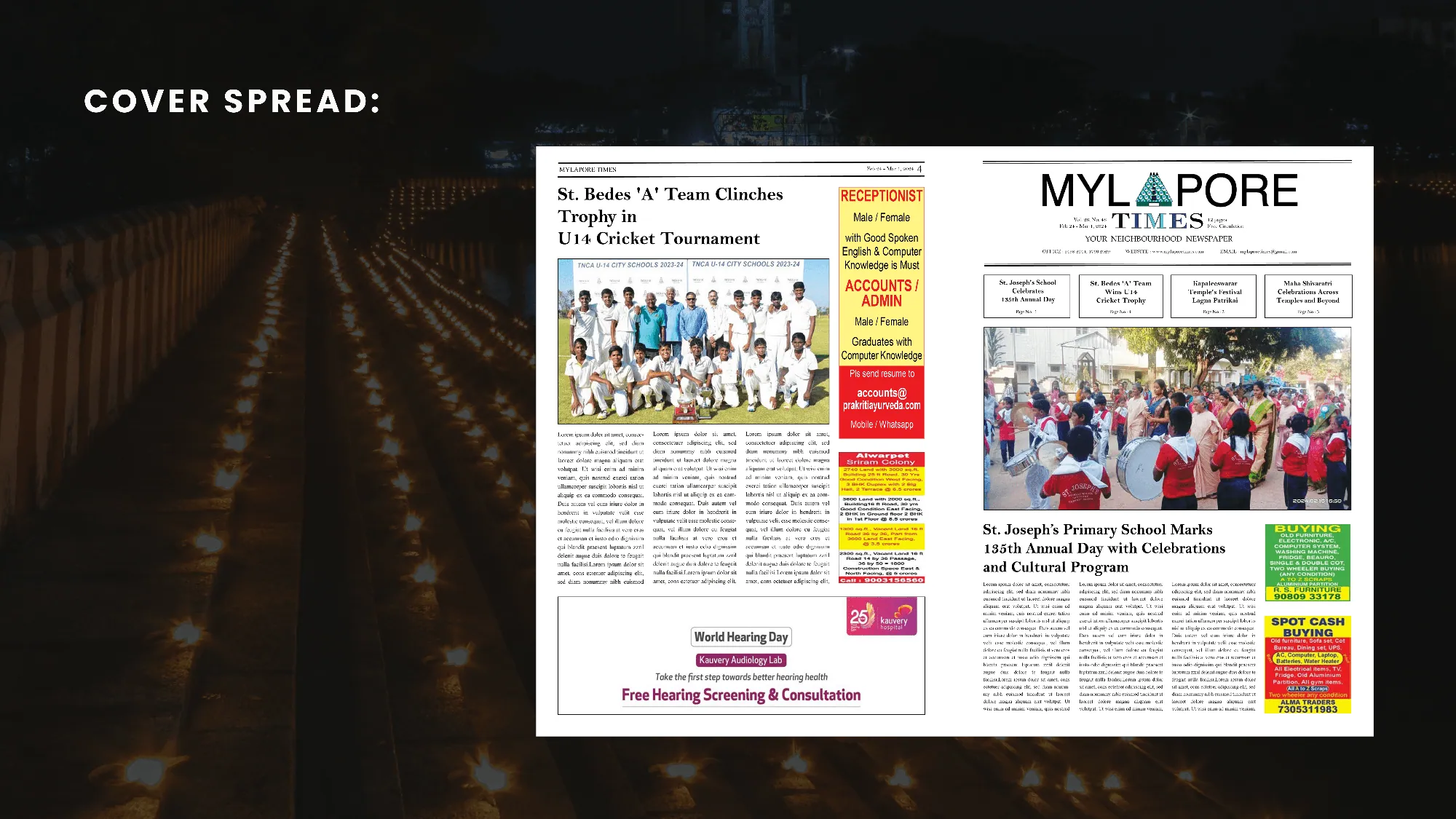
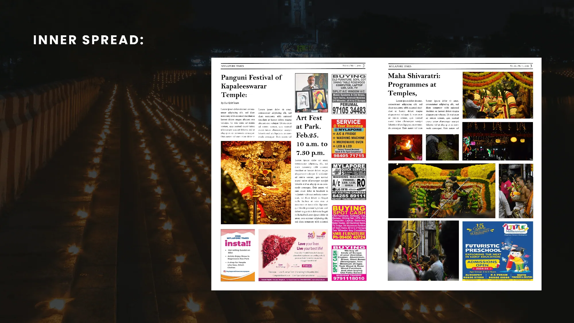
After

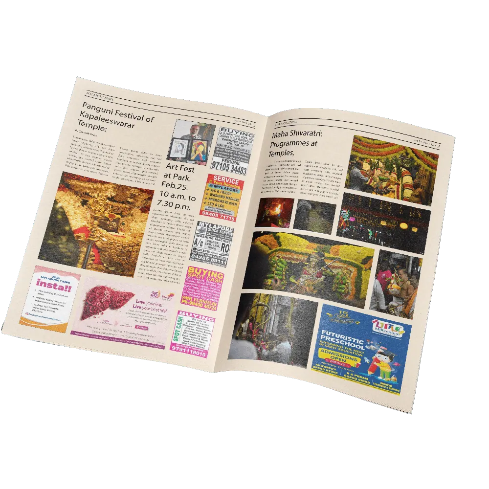
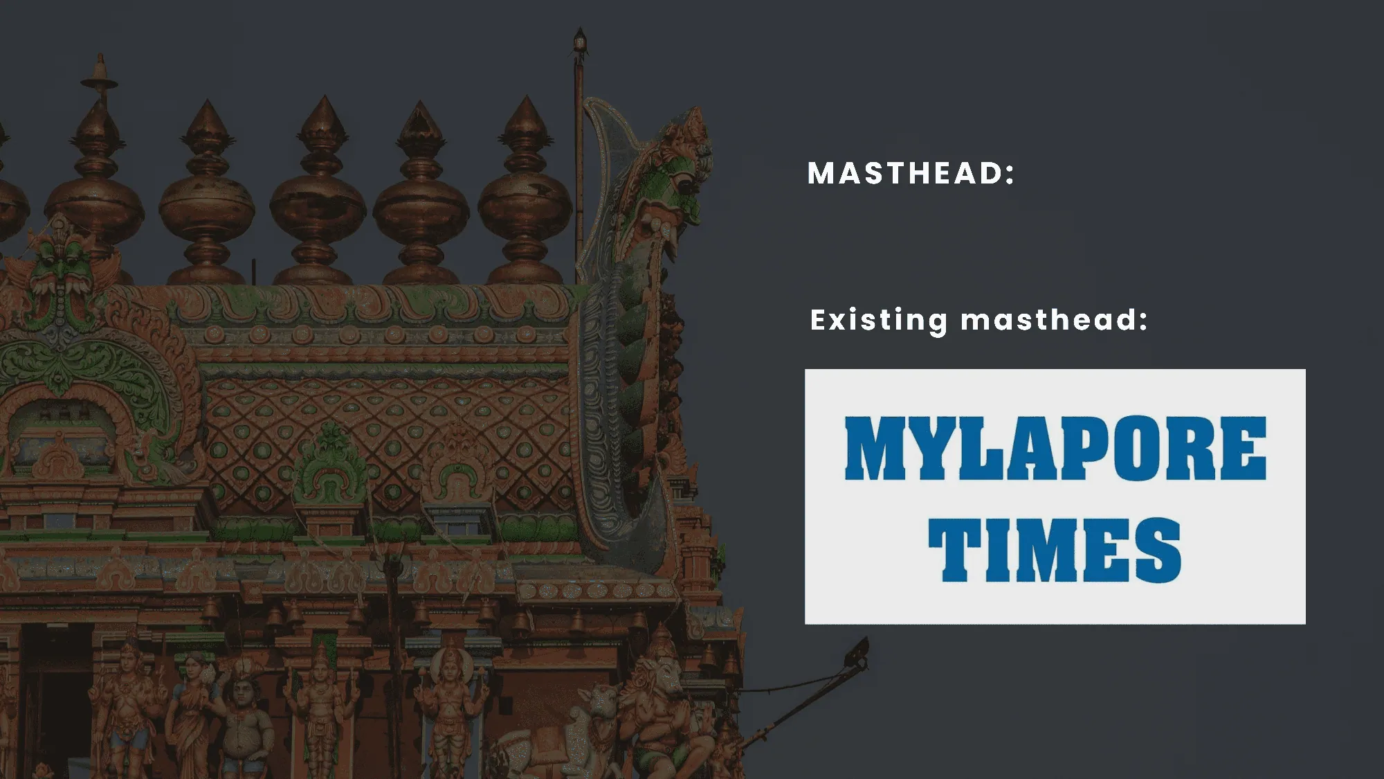
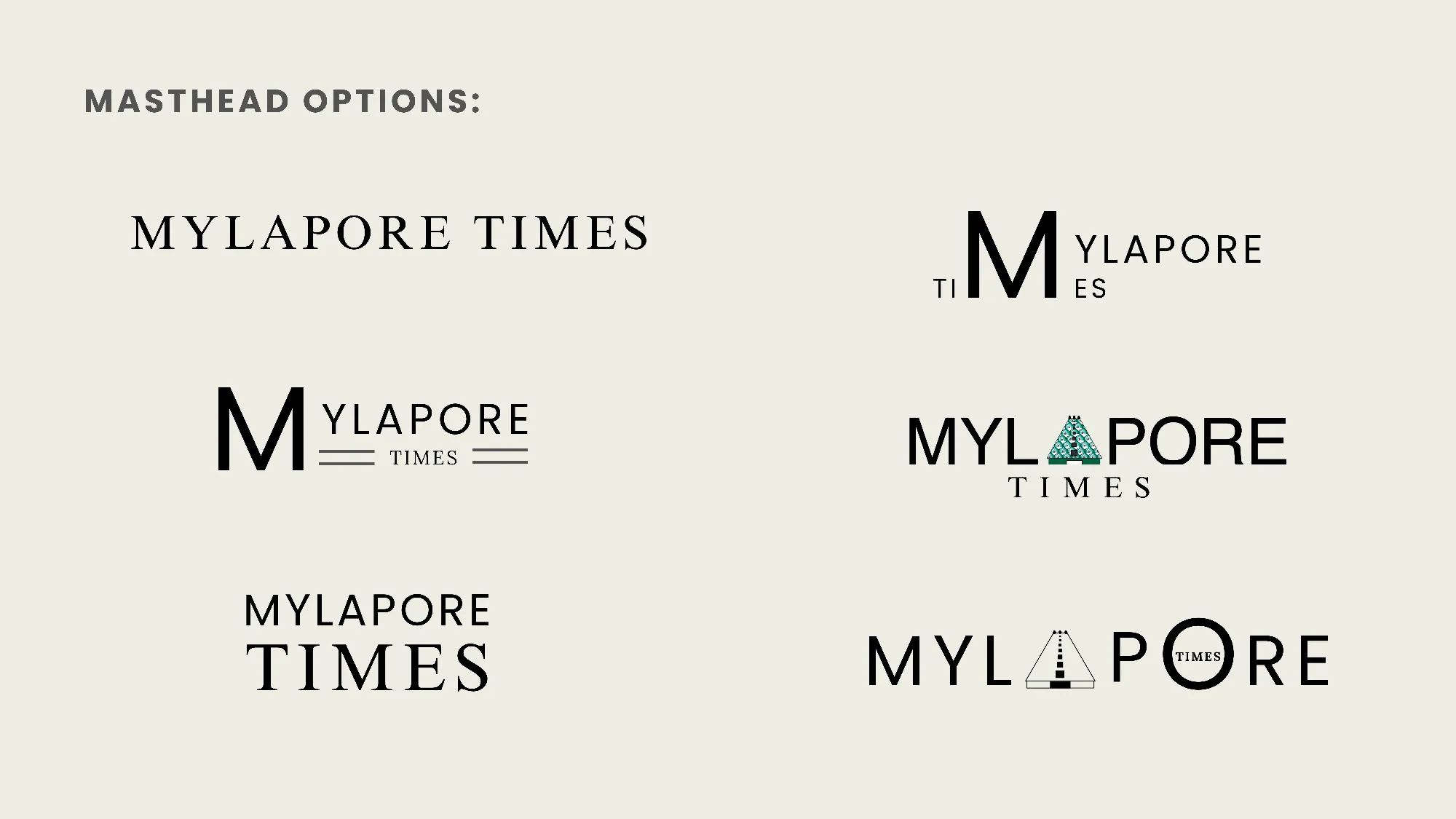
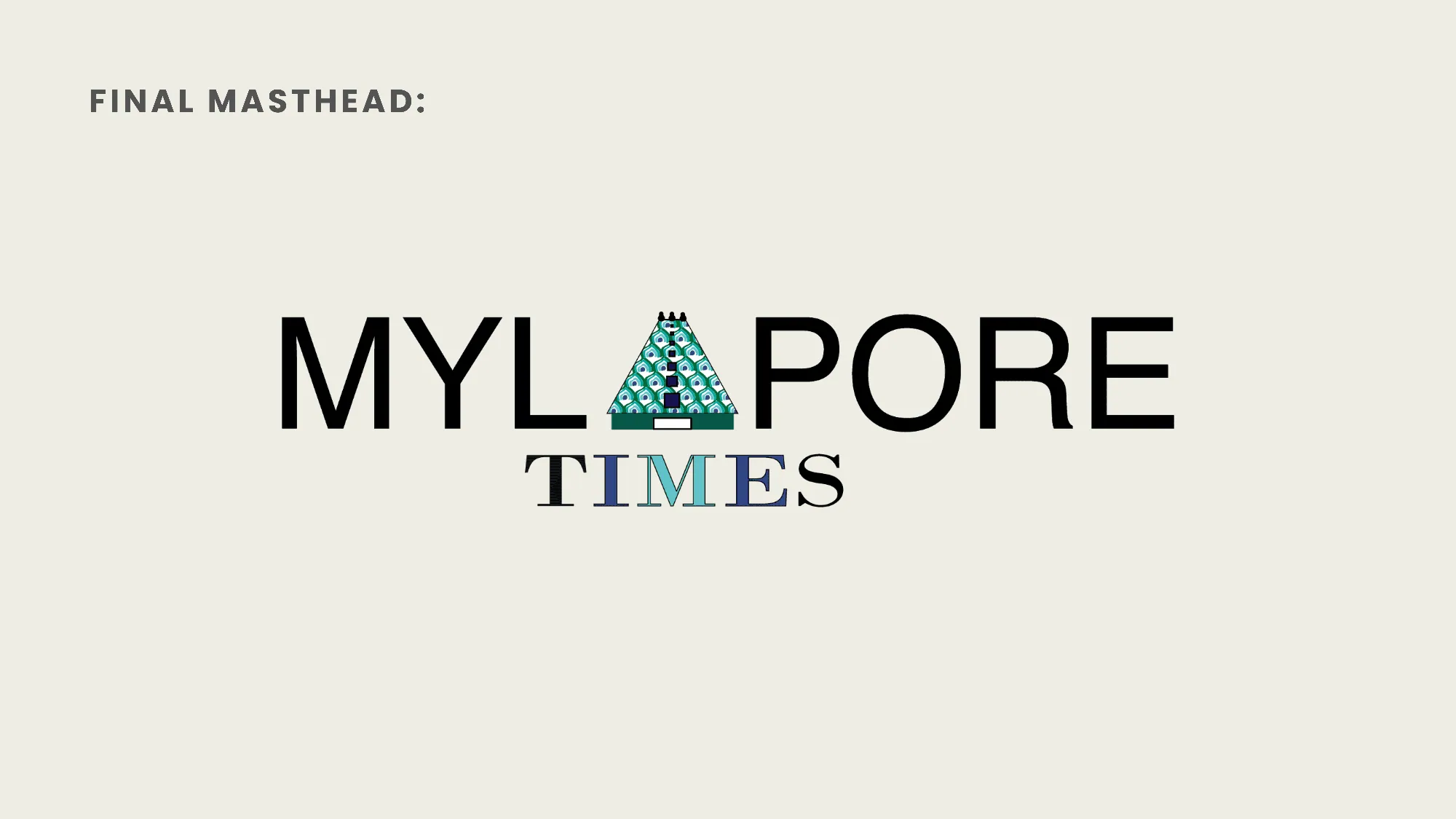
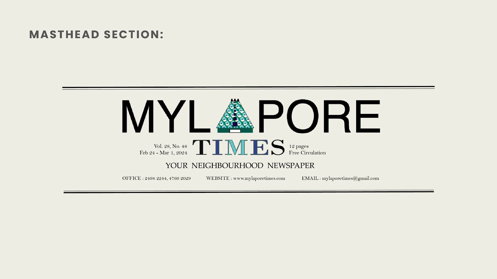
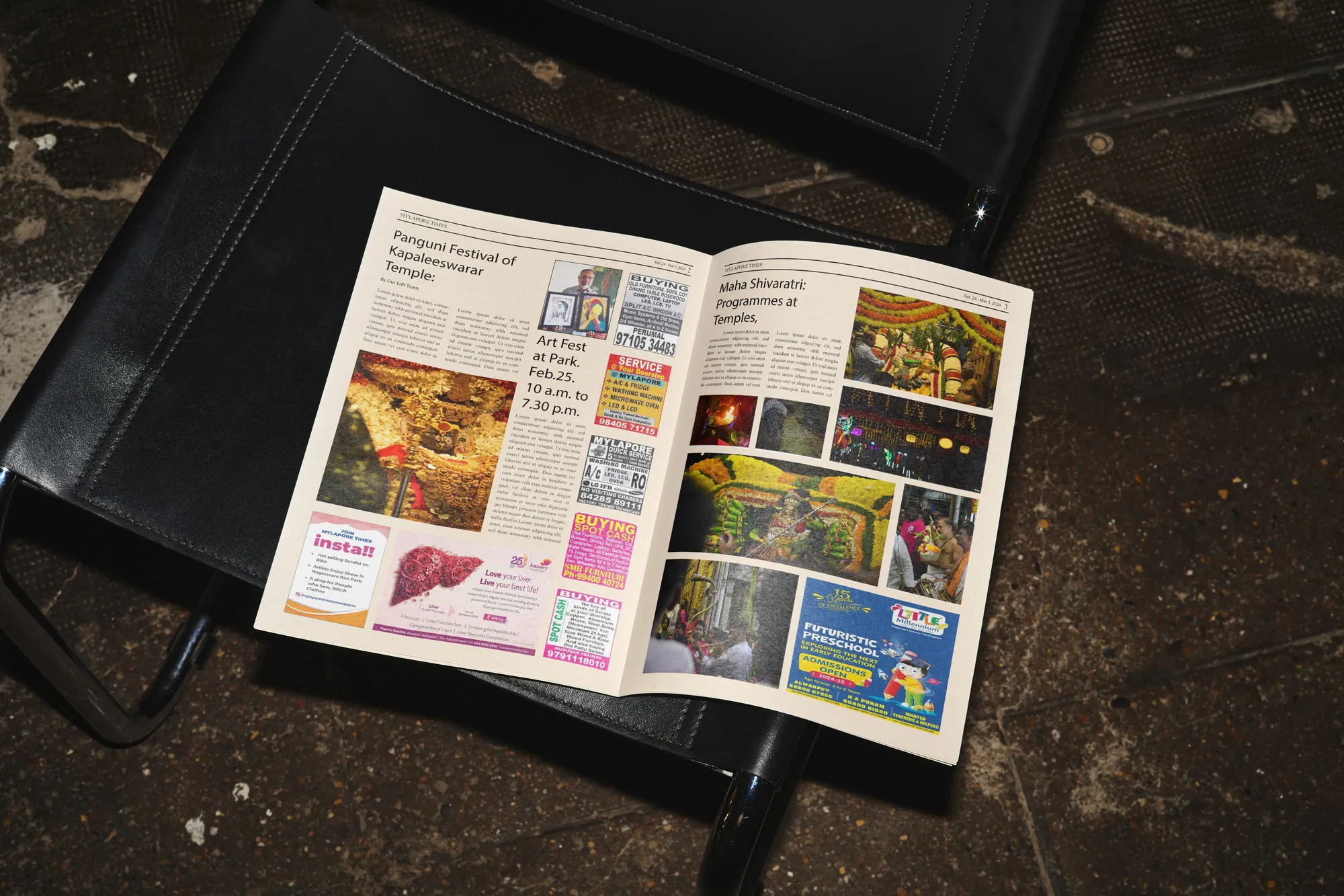
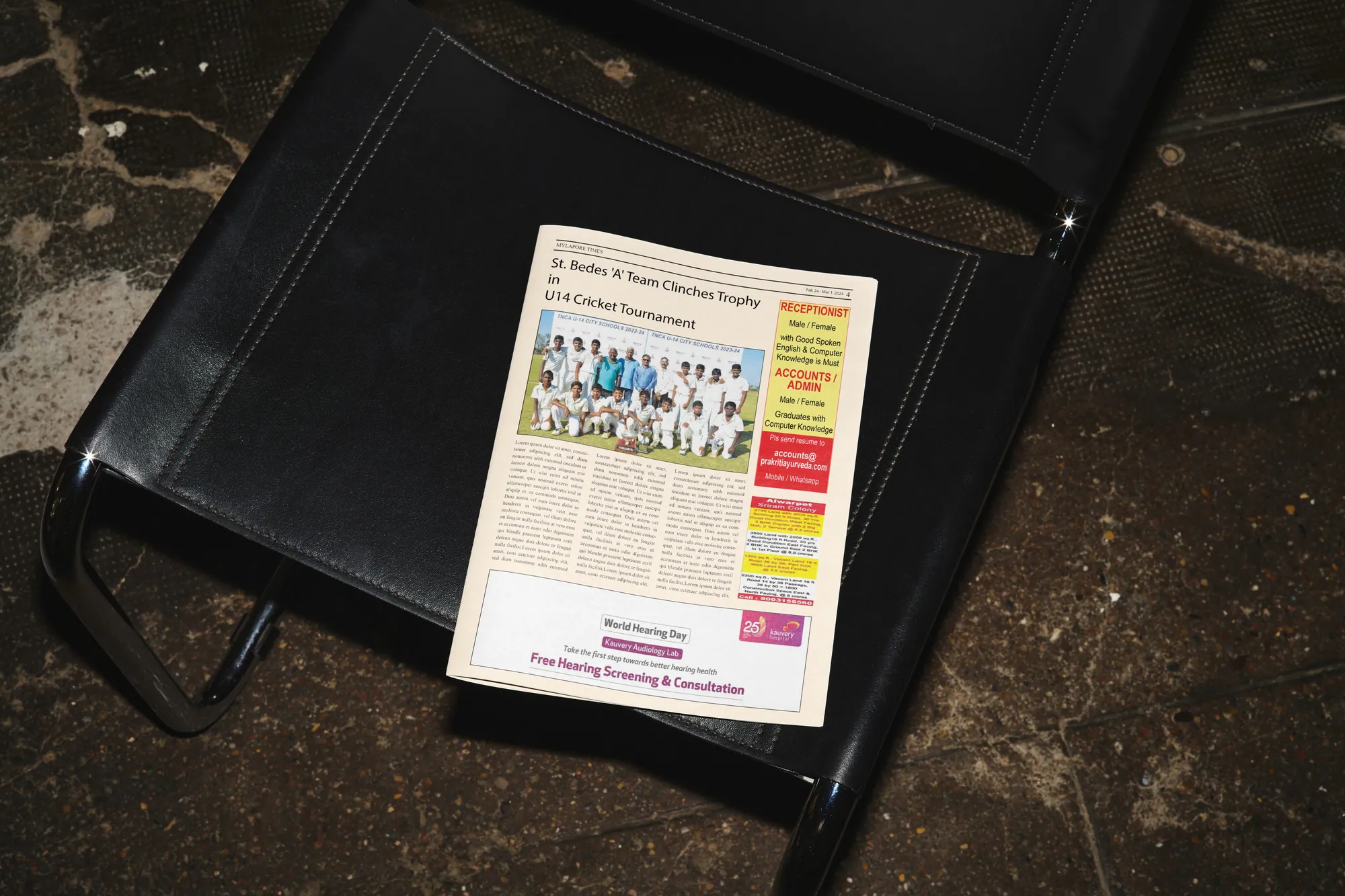
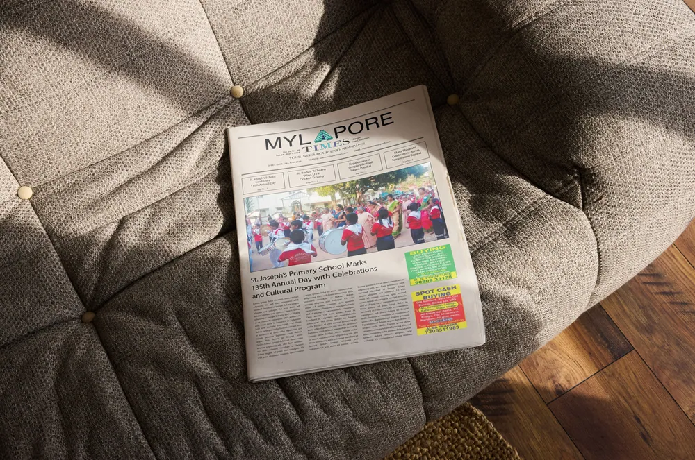
Redesigned front page Redesigned masthead and peacock motif

Redesigned newspaper spread

Concept note

  1. Place

    Mylapore, one of Chennai's oldest neighbourhoods, home to the Kapaleeshwarar Temple, known for its heritage, traditional architecture, and vibrant festivals.

  2. Symbol

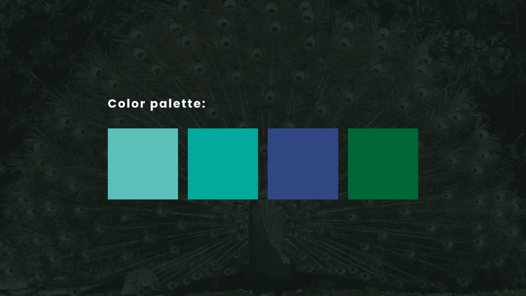
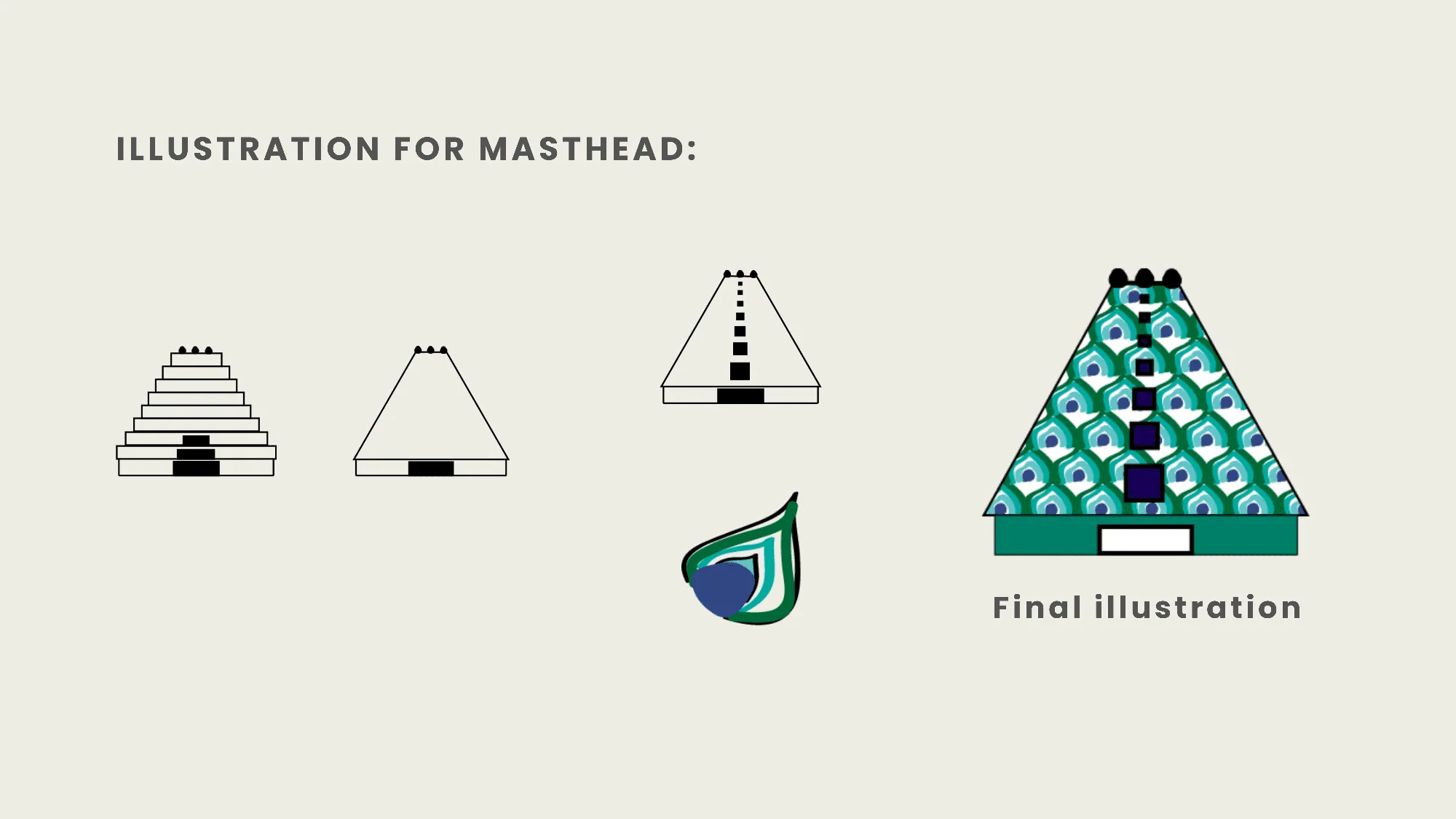
    The peacock. According to the Brahmanda Purana, Mylapore was once called Mayurapuri, with “Mayur” meaning peacock in Sanskrit, based on the legend of Goddess Parvati worshipping Lord Shiva here in the form of a peacock.

  3. Intent

    To weave these cultural elements into the editorial design, connecting Mylapore's historical roots with a modern aesthetic that balances heritage with clarity.
Mylapore Times redesign, image 1 Mylapore Times redesign, image 2 Mylapore Times redesign, image 3 Mylapore Times redesign, image 4 Mylapore Times redesign, image 5 Mylapore Times redesign, image 6 Mylapore Times redesign, image 7 Mylapore Times redesign, image 8 Mylapore Times redesign, image 9 Mylapore Times redesign, image 10 Mylapore Times redesign, image 11 Mylapore Times redesign, image 12 Mylapore Times redesign, image 13
Folded Mylapore Times newspaper on a sofa Mylapore Times being read